
Most LinkedIn analytics tools are built for the wrong question. They answer "how did this post perform?" when B2B teams need to answer "did this post reach the right people, and did it move them?"
That's not a minor distinction. It's the difference between a scoreboard and a compass.
Why do most LinkedIn analytics tools measure the wrong things?
The dominant metrics in LinkedIn analytics software — impressions, reactions, follower growth — are easy to pull from the API and easy to visualize. They're not useless, but they're incomplete in a specific way: they tell you about volume, not about fit.
A post with 8,000 impressions among junior students is worth less to a B2B SaaS team than a post with 900 impressions among VP-level buyers at target accounts. Native LinkedIn analytics doesn't make that distinction. Neither do most third-party tools.
The root cause is commercial: most LinkedIn analytics software was built for individual creators and social media managers optimizing for growth. B2B revenue teams have a different objective — pipeline, not audience size. The metrics that serve one group poorly serve the other.
This matters more now because LinkedIn has become a primary research channel for B2B buyers. As explored in LinkedIn for B2B Marketing: Fix the Scoreboard First, the measurement problem isn't a reporting inconvenience — it actively distorts content strategy when teams optimize for the metrics their tools surface.
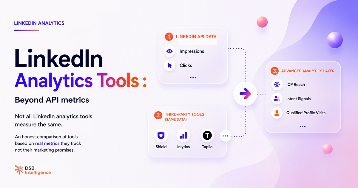
What does native LinkedIn analytics actually give you?
Native analytics is the baseline every team has access to, and it's more useful than it gets credit for — within its limits.
For personal profiles and company pages, LinkedIn provides: total impressions per post, unique viewers (approximated), reactions broken down by type, comments, reposts, and follower demographics aggregated at the account level. For company pages, you also get visitor analytics and follower acquisition trends.
What it doesn't give you: post-level audience breakdown by job title or seniority, historical data beyond 365 days, cross-post benchmarking against your own content, or any signal about why a post performed the way it did.
The demographic data exists at the account level but not at the post level. You can see that 34% of your followers are in "Marketing" — you can't see whether your last ten posts reached that segment or missed it entirely.
For teams publishing at low frequency (fewer than two posts per week), native analytics is often sufficient. For teams running a deliberate content program tied to pipeline, it runs out of signal fast. What Are Post Impressions on LinkedIn — and What They Miss breaks down exactly where that ceiling sits.
How do third-party tools differ — and where do they stop?
Third-party LinkedIn analytics tools broadly fall into two categories: export-and-visualize tools, and signal-detection tools. The distinction matters.
Export-and-visualize tools (Shield, Inlytics, and most scheduling platforms with analytics add-ons) do three things well: they store historical data beyond LinkedIn's native window, they let you compare posts side by side, and they build charts that are easier to share in a slide deck. Shield is the most widely used in this category — its post-level breakdown and follower growth tracking are clean and reliable.
What they don't do: they don't tell you whether your content is reaching ICP-matching accounts. They don't flag when your reach composition shifts. They don't surface the difference between a post that got 500 reactions from your existing followers and one that got 200 reactions from net-new ICP profiles. Reaction count looks the same in both cases.
Signal-detection tools go further. They attempt to answer not just "what happened" but "what does this pattern mean for your next decision." This is where dwell time becomes relevant. LinkedIn has publicly acknowledged that time spent on a post influences its distribution — it's a consensus signal in the organic marketing space. A post that holds attention for 8 seconds per viewer is algorithmically different from one that gets scrolled past after 2 seconds, even if both show the same impression count.
DSB Intelligence's Insight Narrator operates at this layer: when a post shows high impressions but low dwell-time-equivalent signals, it flags the gap and explains the likely cause — format mismatch, hook failure, or audience-topic misalignment. That's a different class of output than a bar chart.
Which metrics actually predict B2B pipeline impact?
No LinkedIn analytics tool connects content directly to CRM pipeline without a custom integration. That's a hard constraint of the platform. But there are proxy signals that correlate with pipeline activity, and the best tools surface them.
The four signals worth tracking, in order of predictive value:
Profile visits from ICP accounts after a post goes live. A spike in profile visits from VP-level titles at target-company sizes in the 48 hours after publishing is a stronger pipeline signal than 300 reactions from a general audience. Most tools don't segment this. LinkedIn Lead Generation: 4 Intent Signals That Build Pipeline maps how this signal connects to outbound sequencing.
Reach composition by seniority and function. Not total reach — reach among the job titles that match your ICP. A post that reaches 1,200 people, 40% of whom are decision-makers in your target vertical, outperforms a post that reaches 5,000 people with 8% ICP match.
Content-to-connection conversion rate. How often does a post trigger a connection request or a DM from a net-new ICP profile? This is measurable manually over time and is one of the cleaner proxies for content that creates commercial intent.
Topic-level engagement patterns. Which content topics generate disproportionate engagement from ICP job titles? This requires cross-post analysis over at least 60 days — it's not visible in a single post's metrics.
For teams running paid alongside organic, the benchmark question shifts. LinkedIn Ads Benchmark: What the Averages Hide covers why aggregate CTR and CPL numbers mislead when audience composition varies.
How should you choose between LinkedIn analytics tools?
The right frame isn't features — it's decisions. Ask: what decision can I make with this tool that I can't make today?
If the answer is "export my data to a spreadsheet and make prettier charts," you're buying a reporting tool. That's fine if your current problem is reporting. It won't change your content strategy.
If the answer is "understand which content topics are resonating with VP-level buyers at Series B+ companies, and adjust my editorial calendar accordingly," you need a tool that segments reach by audience attributes and tracks patterns across posts over time.
A practical decision tree:
- Publishing fewer than 3 posts per week, no dedicated content team → native LinkedIn analytics is sufficient. Invest the tool budget elsewhere.
- Active content program, need historical data and cross-post benchmarking → Shield or Inlytics cover this well. Budget: $15–$40/month per seat.
- B2B team with pipeline accountability, need ICP reach segmentation and content recommendations → you need signal-detection tooling. This is the gap DSB Intelligence is built for.
The LinkedIn Lead Gen Forms layer adds another dimension: if your content drives form fills, you need to track fill rate versus SQL rate separately — a distinction most analytics tools ignore entirely. LinkedIn Lead Gen Forms: Fix Fill Rate vs. SQL Rate covers the measurement setup.
One honest caveat: no tool eliminates the need for editorial judgment. The best LinkedIn analytics software surfaces patterns — it doesn't write your content strategy. The human decision about what to publish, to whom, and why still sits with your team.
Now what?
- Audit your current tool against one question: does it show you reach by job title or seniority at the post level? If no, you're flying partially blind on audience fit.
- Pull your last 20 posts and rank them by profile visits generated in the 48 hours post-publish — not by reactions. That ranking will likely surprise you.
- If you're on a content program tied to pipeline, set a 60-day benchmark window: track ICP reach composition per post, not just total impressions. Most tools let you export the raw data even if they don't visualize it natively.
- Ready to see what signal-detection looks like in practice? Start a free trial of DSB Intelligence and run your last 30 days of content through the Insight Narrator.