
Impressions are the most-watched number in LinkedIn analytics — and the least understood.
Most teams treat a rising impression count as proof their content is working. It isn't. It's proof LinkedIn's algorithm decided to push the post. Those are two different things, and conflating them leads to strategy decisions built on noise.
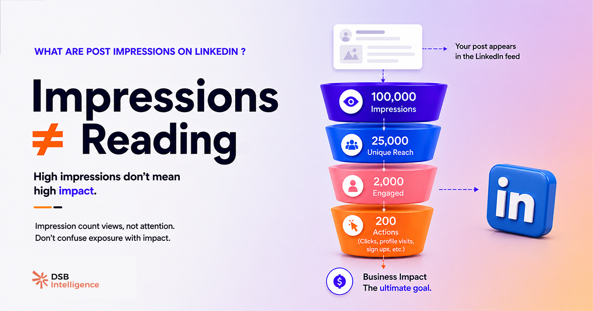
What does "impression" actually mean on LinkedIn?
An impression is recorded the moment a post is rendered on any screen. That includes the feed, search results, the "Featured" section of a profile, and embedded previews in notifications. LinkedIn does not require the user to pause, click, or read. The post entering the viewport is enough.
More importantly: impressions are not deduplicated. If the same person sees your post in their feed on Monday morning, again via a connection's share on Monday afternoon, and a third time when they visit your profile — that's three impressions from one person. The raw number you see in LinkedIn analytics is a total rendering count, not a unique viewer count.
This distinction matters more than most guides acknowledge. A post with 10,000 impressions could represent 10,000 different professionals each seeing it once, or 2,000 people seeing it five times. The number looks identical. The strategic implication is completely different.
For a deeper look at how LinkedIn defines the boundaries of this metric — and what it systematically leaves out — see What Are LinkedIn Impressions — and What They Miss.
How is reach different from impressions — and which one should you track?
Reach is the deduplicated version of impressions. It counts unique accounts that were served your post at least once.
The ratio between the two is where the signal lives. A reach-to-impressions ratio close to 1:1 means almost everyone saw the post exactly once — typical of a post that got one distribution wave and stopped. A ratio of 1:6 or higher means a small group is seeing the post repeatedly, which can indicate either strong algorithmic recycling or a narrow audience that LinkedIn keeps targeting because it ran out of new accounts to show the post to.
Neither extreme is inherently good or bad. But if your goal is LinkedIn content visibility across new audiences — top-of-funnel awareness, brand discovery — then reach is the metric to optimise. Impressions will follow. Chasing impressions directly often means optimising for repeat exposure to the same people, which has diminishing returns after the second or third view.
One practical rule: when a post's impressions grow faster than its reach over a 48-hour window, the algorithm is recycling rather than expanding. That's a signal to look at your content format and hook — not to celebrate the impression spike.
What are impressions on LinkedIn comments — and are they useful?
Comment-level impressions work differently from post impressions, and LinkedIn's own interface makes this easy to misread.
When LinkedIn reports impressions on a comment, it reflects how many times the post thread containing that comment was loaded — not how many people specifically read your comment. Comments don't have independent distribution. They inherit the post's distribution, filtered by how many users expanded the comment section.
In practice, this means comment impressions are a proxy for thread engagement, not comment-level visibility. A comment on a high-impression post can show thousands of "impressions" while being seen by a fraction of that number, because most users scroll past comment sections without expanding them.
The metric worth tracking for comments is not impressions — it's replies and profile clicks generated from the comment. Those are harder to pull natively from LinkedIn analytics, but they're the actual signal of whether your comment drove attention to you specifically.
Why do impressions spike — and what does it actually signal?
Impression volume on LinkedIn is largely a function of what happens in the first 60 to 90 minutes after posting. Early engagement — reactions, comments, shares — signals to the feed algorithm that the post is worth distributing further. The algorithm then pushes it to a wider audience, generating more impressions. The spike you see at hour two or three is almost always a downstream effect of that early engagement window, not a direct result of the content quality.
This is why two posts with identical quality can produce radically different impression counts depending on the day, time, and whether your most-engaged connections happened to be online. For a data-grounded look at how timing affects distribution, Best Time to Post on LinkedIn: Find Your Window breaks down the mechanics without the generic "post on Tuesday at 8am" advice.
The DSB Intelligence Insight Narrator surfaces exactly this pattern: when a post's impression curve peaks early and drops sharply within 24 hours, it flags the post as "one-wave distribution" — meaning the algorithm gave it one push, the early engagement wasn't strong enough to trigger a second wave, and the content effectively stopped circulating. That's a different diagnosis than a post that builds impressions slowly over 72 hours, which typically indicates shares from second-degree connections carrying the distribution.
What impression benchmarks are actually worth using?
Absolute impression numbers are almost meaningless without context. A post from a profile with 800 followers getting 3,000 impressions is a strong result. The same number from a profile with 50,000 followers signals a near-total distribution failure.
The metrics that give impressions context:
- Engagement rate on impressions — total interactions divided by total impressions. Industry consensus places meaningful B2B content above 2–3% on this ratio, though format matters significantly (documents and polls outperform plain text on this metric).
- Reach-to-impressions ratio — as discussed above, a directional indicator of whether you're reaching new people or recycling to the same ones.
- Saves and shares per 1,000 impressions — the highest-quality engagement signals, because they require deliberate intent. A post with 10,000 impressions and 50 saves is performing better than one with 20,000 impressions and 30 saves.
For paid content, impressions interact with CPM and CTR in ways that require a different benchmarking lens entirely. LinkedIn Ads Benchmark: What the Averages Hide covers why aggregate benchmarks mislead on the paid side.
If your impressions are strong but your pipeline isn't moving, the problem is rarely the impression count — it's what happens after the click. LinkedIn Lead Gen Forms: Fix Fill Rate vs. SQL Rate addresses that conversion gap directly.
And if you're trying to build a repeatable system around these metrics rather than chasing individual post performance, B2B Marketing with LinkedIn: Fix the System First is the right starting point.
Now what?
- Pull your last 10 posts and calculate reach-to-impressions ratio for each. Flag any post above 1:5 — that's where you're over-serving a small audience.
- Add saves and shares per 1,000 impressions to your reporting dashboard. Drop raw impressions as a primary KPI.
- Audit your posting time against your first-hour engagement data. If your best posts consistently spike late, you're losing the early-window distribution boost.
- Stop optimising for impressions directly. Optimise for early engagement quality — the impressions follow automatically when the algorithm sees a post worth distributing.
Track all of this without switching between five tabs — start a free trial of DSB Intelligence and get your LinkedIn analytics in one place, with the context that makes the numbers actionable.