

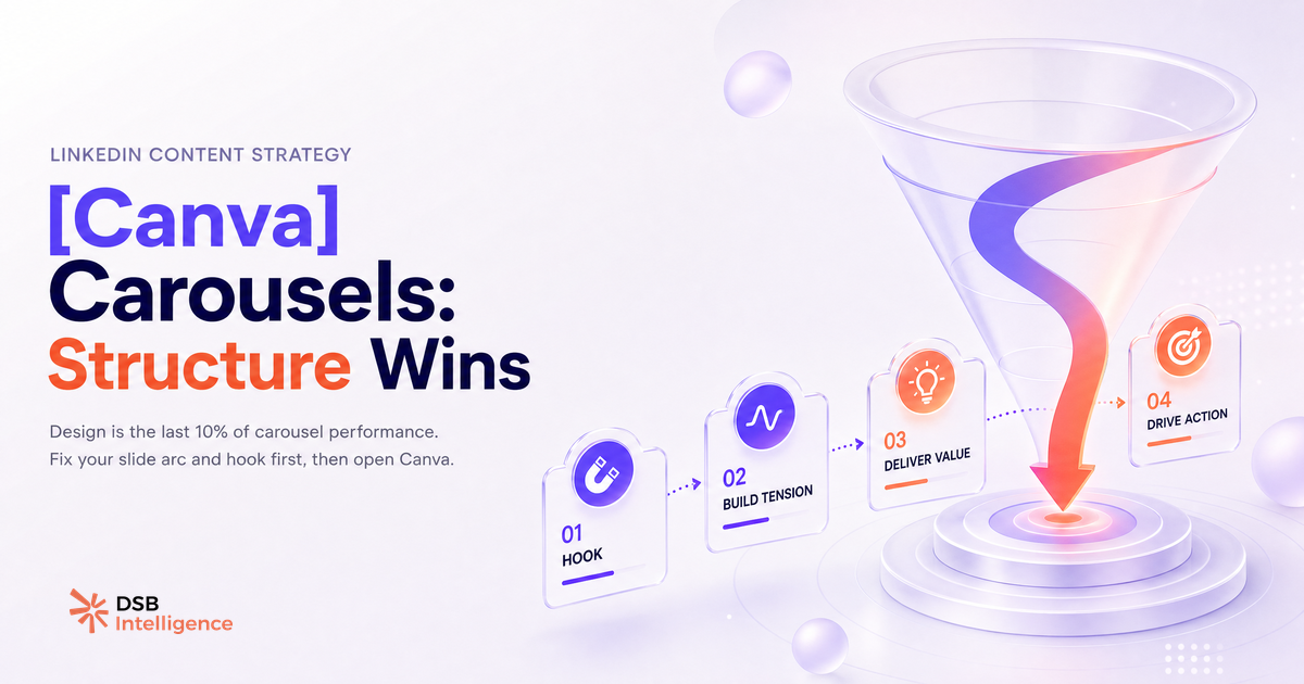
Most carousels on LinkedIn are beautiful. Most also disappear within hours of posting. The design is not the problem — the structure is.
The SERP is full of template galleries — why do most carousels die at 200 impressions?
Search "canva linkedin carousel templates" and you get hundreds of galleries. Every one of them shows you what slides look like. None of them explain why the carousel stops distributing.
The failure happens on slide 1. Not in the color palette, not in the font choice. On slide 1.
When a viewer lands on a carousel post and does not swipe, LinkedIn registers a low-engagement signal. The post gets less secondary distribution. It stalls. The creator assumes the topic was wrong, or the design was off, and downloads another template.
The real issue is simpler: slide 1 gave the answer before creating the tension that makes someone swipe. A viewer who already has what they came for has no reason to continue. No swipe, no dwell time, no reach.
This is why template galleries are a trap. They optimize for visual appeal at the thumbnail stage, not for behavioral mechanics across the full swipe sequence. See also: LinkedIn Post Templates Are a Trap (And What Works Instead).
What does the algorithm actually reward in a carousel — and it is not the design?
LinkedIn's document post format has a measurable advantage over static images or text posts: it generates dwell time data. The platform can detect how long a viewer stays on a carousel, how many slides they view, and whether they return to it.
That sustained attention is a stronger distribution signal than a like. A post that earns 3 likes but holds 40 viewers on slide 3 is likely to receive more secondary distribution than a post with 15 likes and an average view depth of 1.2 slides.
Design does not move that needle. Narrative structure does.
The algorithm does not read your slides. It reads behavior. And behavior is driven by whether each slide creates enough unresolved tension to pull the reader forward. A polished Canva template with six branded slides and a summary on slide 2 kills that tension immediately.
This is also why raw engagement metrics mislead most creators. Likes are a sentiment signal. Dwell time is an attention signal. They measure different things, and only one of them predicts whether the algorithm will push the post further.
How DSB Intelligence Insight Narrator reads carousel engagement signals differently than raw likes
Most analytics tools surface likes, comments, and impressions. That is the easy data. It is also the least useful data for diagnosing why a carousel underperformed.
The DSB Intelligence Insight Narrator is built for a different job: it reads the pattern behind the numbers. When a carousel shows high impressions but low engagement depth, Insight Narrator flags the likely failure point — not as a generic "engagement is low" alert, but as a readable diagnosis of where in the swipe sequence attention dropped. That distinction matters when you are deciding whether to rebuild slide 1 or rethink the topic entirely.
Treating a carousel like a static post and measuring it with static post metrics is the fastest way to draw the wrong conclusion from good data.
What is the 4-slide structure that consistently extends dwell time on LinkedIn?
The most reliable carousel structure on LinkedIn is not the longest one. It is the tightest one.
Four slides, each with a single job:
-
Slide 1 — Tension. A counterintuitive claim or an unresolved question. The reader must not be able to answer it without swiping. "Your best-performing post is probably your worst signal" is a tension. "10 tips for LinkedIn reach" is not.
-
Slide 2 — Complication. You deepen the problem. You show why the obvious answer fails. This is where most templates skip directly to the solution — and where most carousels lose the reader.
-
Slide 3 — Resolution. A concrete mechanism, not a platitude. "Here is the specific thing that changes the outcome" — with enough specificity that the reader feels they learned something they could not have guessed.
-
Slide 4 — Next step. Not a call to action in the marketing sense. A behavioral prompt: what does the reader do with this in the next 24 hours? Make it small enough to be credible.
This structure works because it mirrors how attention actually moves: toward unresolved questions, not toward information. Each slide earns the next one. That is the mechanic that drives dwell time, and dwell time is what drives linkedin carousel reach.
For a deeper breakdown of the mechanics behind this format, see Comment faire un carrousel LinkedIn qui retient l'attention.
When does a polished Canva template actively hurt your reach?
There is a specific scenario where a well-designed template backfires: when it signals "corporate deck" before the reader has a reason to care.
Fast-scrolling LinkedIn users pattern-match in under a second. A slide with a logo in the top-left corner, a headline in a brand font, and a subtitle reads as a presentation. Presentations are skipped. The thumb moves on before the content has a chance to register.
This is not a design quality problem. It is a context mismatch. The template was built for a slide deck environment, not for a feed where the first frame competes with 40 other posts.
The templates most likely to hurt reach share three traits: they front-load branding, they use a headline-plus-subtitle layout on slide 1, and they summarize the content rather than withhold it. All three behaviors reduce the probability of a swipe.
The fix is not to abandon Canva. It is to use it for visual consistency on slides 2 through 4, and to treat slide 1 as a blank canvas with a single constraint: the reader must not know what comes next.
This dynamic applies to paid formats too. Thought Leader Ads LinkedIn : ce que le format fait vraiment au pipeline covers how the same attention mechanics play out when budget is behind the post.
If you are using an AI tool to generate carousel copy, the same structural logic applies — the output is only as good as the brief you give it. AI LinkedIn Post Generators: What They Really Produce is a useful calibration before you automate the wrong structure at scale.
And if you are thinking about referral or outreach carousels specifically, LinkedIn Referral Templates Miss the Point covers why template logic fails even harder in a 1:1 context.
Et maintenant ?
- Open your last carousel. Check slide 1: does it give the answer, or does it create a question the reader needs to swipe to resolve? If it gives the answer, rewrite slide 1 before anything else.
- Cut your next carousel to four slides. Force yourself to give each slide exactly one job. Add slides back only if you can name the specific tension each one creates.
- After publishing, ignore likes for the first 48 hours. Watch save rate and comment depth instead — those are the signals that predict whether the algorithm will extend distribution.
- Ready to stop guessing at what your carousel data actually means? Start a free trial of DSB Intelligence and let Insight Narrator read the engagement pattern for you.