

The agency that spent three weeks perfecting its branded client dashboard login flow — custom subdomain, SSO, white-label everything — watched its clients stop opening the portal within 60 days of launch. The login worked. The dashboard didn't.
What do client dashboards actually get wrong — and why is login friction a symptom, not the problem?
Login friction is the wrong diagnosis. When a client complains that accessing the dashboard is "too many steps," they're rarely talking about the number of clicks. They're rationalizing a deeper frustration: they got in, looked around, and left without an answer.
The client dashboard login experience gets blamed because it's the first point of resistance. But the real abandonment happens 30 seconds after login, when the client scans the screen and can't immediately locate the signal they came for.
This pattern is consistent across agency reporting tools. A client portal built around data completeness — every metric tracked, every dimension available — creates a navigation problem disguised as a reporting product. The client isn't an analyst. They don't want to build the answer. They want to read it.
The agencies that retain active dashboard users are the ones that made a deliberate choice: fewer metrics, sharper framing, one clear headline per session. That's a product decision, not a UX tweak. No amount of login optimization fixes a dashboard that buries its insight behind three filter dropdowns.
For a grounded look at how this plays out in debt-relief and financial services contexts, Freedom Debt Relief Client Dashboard: What It Shows and Hides breaks down a real example of metric selection gone wrong.
What data do clients open the dashboard to find — and what do they close it without seeing?
Clients come to a reporting dashboard with one of three questions. Not ten. Three.
"Is this working?" They want a trend line, a benchmark comparison, or a simple up/down signal against last period. If the dashboard opens on a raw data table, they can't answer this without doing math. They won't do the math.
"What changed?" Something happened — a post went viral, a campaign launched, a competitor made noise. The client wants to know if the numbers moved and why. A dashboard that doesn't flag anomalies forces the client to hunt for the change manually. Most don't bother.
"What do we do next?" This is the question most agency dashboards ignore entirely. Clients aren't passive consumers of data. They're decision-makers who need a prompt. A recommended action, a flagged opportunity, a suggested adjustment — anything that closes the loop between insight and decision.
If the client reporting dashboard doesn't answer at least one of these three questions on the first screen, it fails its primary job. The client closes the tab. They send a Slack message asking for a summary instead. The dashboard becomes a cost center with no adoption.
The SEO Client Reporting Is Broken — Fix It Now piece covers the same structural failure in organic search reporting — worth reading alongside this if your agency runs multi-channel dashboards.
How should client-facing analytics be structured so the insight lands before the question is asked?
The answer is to invert the architecture. Most dashboards are built data-first: collect everything, display everything, let the client find what matters. The better model is decision-first: identify the client's current goal, map the one or two metrics that signal progress toward it, and lead with those.
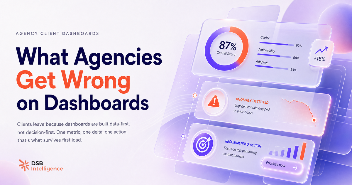
In practice, this means the first-load screen of a client analytics portal should contain three elements and nothing else: the headline metric for this client's goal, a delta from the previous period (with a directional signal), and one sentence of context or recommended action.
Everything else — the full breakdown, the historical charts, the audience demographics — lives one click deeper. It's available. It's just not the default view.
This is where most reporting automation for agencies stalls: teams automate the data pipeline but never curate the presentation layer. The result is a perfectly fresh, perfectly useless dashboard.
For LinkedIn-specific analytics, DSB Intelligence's Insight Narrator is built around exactly this inversion: it reads the underlying metric pattern and surfaces a plain-language interpretation — what moved, why it likely moved, and what it implies — so the client sees the conclusion before they have to ask the question.
The What a Personal Branding Agency Actually Does for B2B article shows how this framing applies when the client's goal is reach and authority-building rather than direct conversion.
What should a client dashboard surface on first load — a practical checklist?
A strong first-load screen for a dashboard client access experience covers four things. Not more.
-
The primary signal for this client's goal. One number, one trend line, one status indicator. If the client's goal is LinkedIn reach growth, that's the 30-day impression trend. If it's engagement quality, that's the comment-to-impression ratio vs. the previous period. One metric, chosen deliberately.
-
A clear delta from the last reporting period. Up, down, flat — with a percentage or a directional arrow. The client should know in two seconds whether things improved. No calculation required on their end.
-
A flagged anomaly if one exists. If something moved significantly outside the normal range, the dashboard should say so explicitly. "Your engagement rate dropped sharply on posts published after 6pm this week" is more useful than a chart the client has to interpret themselves.
-
One recommended next action. This is the hardest element to build and the most valuable. It doesn't have to be complex: "Consider posting earlier in the week based on your last 30-day engagement pattern" is enough. It closes the loop.
For a broader view of which signals matter most in 2026 agency reporting, Marketing Agency Tools in 2026: Track These 4 Signals maps the four indicators that consistently correlate with client retention.
Now what?
- Audit your current client portal: open it as if you're the client. Can you answer "is this working?" in under 10 seconds without clicking anything? If not, the first-load screen needs a redesign.
- Survey three active clients this week. Ask them: "What's the one question you come to the dashboard to answer?" Their answers will tell you what your headline metric should be.
- Add a delta indicator and a plain-language flag for anomalies to your next reporting cycle. You don't need a new tool — a one-line summary at the top of the report does the job while you build the automated version.
- If you're running LinkedIn analytics for clients, try DSB Intelligence free to see how the Insight Narrator layer surfaces conclusions before your clients have to ask for them.