

Most LinkedIn newsletter creators spend time on the writing. The cover image gets five minutes and a Canva template. That is the wrong order of operations.
The cover is the first thing a subscriber sees — in their notification email, in the feed card, in the LinkedIn notification bell. It renders before the title does in several contexts. Getting it wrong does not just look bad. It costs you opens.
What is the exact LinkedIn newsletter cover image size, and what gets silently cropped?
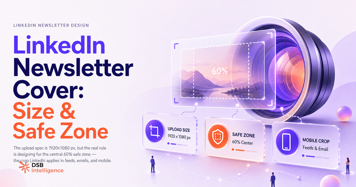
The spec is 1920x1080 px, 16:9 aspect ratio, minimum width 744 px. LinkedIn accepts JPEG and PNG. File size should stay under 8 MB in practice, though the platform's stated limit is higher.
That is the upload spec. The rendering spec is a different story.
LinkedIn does not display your cover at 1920 px wide in every context. In the feed card, it renders as a cropped thumbnail. In the notification email sent to subscribers, it appears at a narrower width with the top and bottom edges trimmed. On mobile, the crop shifts again.
The result: anything you place near the edges of your 1920x1080 canvas risks disappearing entirely in the contexts that matter most. A logo in the bottom-left corner. A headline that bleeds to the right edge. A subject line in the top band.
The practical safe zone is the central 60% of the frame — roughly 1152x648 px centered on your canvas. Treat everything outside that rectangle as decoration, not communication.
For a deeper look at how LinkedIn handles image formats across content types, LinkedIn Video Size: Specs, Ratios & What Drives Reach covers the same cropping logic applied to video thumbnails.
Why does the cover image affect open rate before the subscriber reads a word?
Because the cover renders before the title in at least two delivery surfaces: the notification email preview and the LinkedIn feed card.
In the notification email, the cover image appears above the fold. A subscriber scanning their inbox sees the visual before they process the newsletter name or subject line. Their brain makes a relevance judgment in under a second. If the image is generic stock photography with no text anchor, that judgment is often "not now."
In the feed card, the cover competes with every other post in the feed. LinkedIn does not give newsletters a special visual treatment. The card looks like a link post. The cover is the only differentiator.
This is not a design opinion. It is a sequencing fact: visual processing precedes text processing at the speed of a scroll. The cover image is a pre-click signal, and pre-click signals drive open rate directly.
If you are already thinking about newsletter strategy beyond the image, LinkedIn Newsletter: When It Generates, When It Doesn't maps the full funnel from subscriber to pipeline.
What are the three visual patterns that consistently underperform in newsletter previews?
Three patterns show up repeatedly in newsletters with low engagement, and they share a common failure mode: they were designed for full-width display, not for the thumbnail context where the open decision actually happens.
Full-bleed stock photography with no text anchor. A beautiful landscape or a generic office photo fills the frame. At thumbnail scale, it reads as noise. There is no signal telling the reader what the newsletter covers. The brain skips it.
Dark backgrounds with low-contrast text. Dark navy, charcoal, or black backgrounds look polished on a large screen. In a 200 px wide thumbnail, the text disappears. The contrast ratio that passed your eye at full size fails at small scale. This is the most common mistake in "professional-looking" newsletter covers.
Portrait-oriented layouts forced into a landscape crop. A designer builds a vertical composition — a centered subject with text above and below. LinkedIn crops it to 16:9. The top text and the bottom text both vanish. What remains is the middle of the image, which was never designed to stand alone.
The Insight Narrator in DSB Intelligence flags this kind of pattern when it reads your newsletter performance data: a cover that looks fine in your editor but consistently underperforms in open rate is often a thumbnail rendering problem, not a content problem.
How do you design a cover that works at thumbnail scale, not just full-width?
Start at 400 px wide, not 1920 px wide. Open your design tool, set the canvas to 400x225 px (same 16:9 ratio), and build the cover there first. If the image communicates clearly at that size — readable text, visible logo, clear subject signal — it will hold at full width. The reverse is not true.
Three principles that hold at any scale:
One: high contrast, always. White or near-white text on a dark-but-not-black background (deep blue, forest green, dark teal) reads at thumbnail size. Black text on white reads too. Mid-tones on mid-tones do not.
Two: one visual anchor, not three. A single bold headline, or a single icon plus a short label. Every element you add at full width becomes visual noise at thumbnail scale. Edit ruthlessly.
Three: keep the subject in the center 60%. This maps directly to the safe zone described above. A centered layout survives every crop LinkedIn applies. An edge-heavy layout does not.
This design logic applies across LinkedIn content formats. LinkedIn Articles in 2026: Stop Abandoning Them Too Early covers how the same thumbnail-first thinking applies to article cover images, which share the same rendering constraints.
What does "the right size for a LinkedIn newsletter cover image" actually mean in practice?
It means two things, not one.
The first is the upload spec: 1920x1080 px, 16:9, under 8 MB, JPEG or PNG. That is the technical floor. Miss it and LinkedIn either rejects the image or stretches it in ways you cannot control.
The second is the design spec: build for the thumbnail, protect the safe zone, use high contrast, anchor one message. That is the strategic ceiling. Hit both and your cover does its job — driving the open before the subscriber has read a single word of your newsletter.
The two specs are not the same thing. Most creators know the first. Almost none apply the second.
For context on how LinkedIn handles automation and third-party tools that interact with newsletter publishing, Chrome Extensions for LinkedIn: What Works in 2026 and Best LinkedIn Automation Tools: Safety, Use Case, Risk are worth reading before you build any publishing workflow.
Now what?
- Open your last newsletter cover in your design tool. Overlay a centered rectangle at 60% of the canvas width and height. Check whether your headline and logo fall inside it. If they do not, fix the layout before your next issue.
- Export the cover at 400x225 px and view it at actual size on your phone screen. If you cannot read the text without zooming, the contrast or font size needs to change.
- Set a one-time template in your design tool at 1920x1080 px with the safe zone marked as a guide layer. Every future cover starts from that template.
- Track your newsletter open rate issue by issue. If a redesigned cover correlates with a lift in opens, you have your answer. If it does not, the problem is in the subject line or the send time, not the image.
Ready to connect your newsletter performance data to the rest of your LinkedIn analytics? Start your free trial with DSB Intelligence and see what your cover image is actually costing you in opens.