

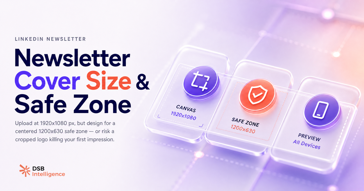
Most LinkedIn newsletter headers are broken. Not because creators don't care — because LinkedIn never tells you exactly how it will render your image.
What are the exact LinkedIn newsletter cover image size specs, and why do they matter beyond aesthetics?
The upload target is 1920 x 1080 px, 16:9 ratio, JPG or PNG, under 8 MB. That part is straightforward.
What LinkedIn does not surface clearly is the rendering chain. Your image does not live in one place. It gets pulled into at least three different contexts — the newsletter landing page, the feed preview card, and the email notification — each with a different crop. Uploading the right dimensions is the entry ticket. Designing for the crop is the actual work.
One edge case worth knowing: some creators report that files above the size limit appear to upload successfully in the editor but fail to render for subscribers — worth testing before publishing. You see a thumbnail in the editor; they see a blank header. This is the kind of issue that costs you subscribers before your content gets a fair read.
The spec matters beyond aesthetics because the cover image is the first rendered element a potential subscriber sees when your newsletter surfaces in the feed or lands in their inbox. It is not decoration — it is the first credibility check.
For context on how LinkedIn handles image rendering across other formats, the same cropping logic applies to video: LinkedIn Video Size 2026: The Specs That Stop the Scroll covers the parallel constraints.
How does the cover image behave differently across feed, email, and mobile?
The same 1920 x 1080 px file gets treated as three different assets depending on where it appears.
On the newsletter landing page, LinkedIn displays the image close to its full 16:9 ratio. This is the most forgiving surface — your full canvas is visible.
In the feed preview card, LinkedIn applies a tighter horizontal crop, centered. Anything outside that window disappears. If your logo or headline text sits near the left or right edge of your original canvas, it will be cut.
In the email notification sent to subscribers, LinkedIn renders a wide, short banner. The crop here is even more aggressive on the vertical axis — think cinematic letterbox. Faces, taglines, and any vertical design elements placed low in the frame get trimmed.
On mobile, the feed card shrinks further and the safe zone tightens. A design that looks clean on desktop can lose its key visual entirely on a narrow screen.
The practical implication: design your cover as if the only space that exists is a centered rectangle in the middle of your canvas. A common empirical rule of thumb — not an official LinkedIn spec — is to use roughly 1200 x 630 px as a guide. Treat everything outside that zone as bleed — useful for background texture, never for information.
This multi-surface behavior is also why LinkedIn Newsletter Is Not Email Marketing — the distribution mechanics are fundamentally different, and the image rendering reflects that.
What does a broken header signal to a first-time subscriber, and how do you fix it in 10 minutes?
A cropped logo or a text-heavy image with half the words missing does not just look unpolished. It tells a first-time subscriber that the creator did not test their own product. That is a trust signal failure, and it happens before they read a word of your content.
The fix is fast. Open your design tool (Figma, Canva, Adobe Express — any of them works). Create a canvas at 1920 x 1080 px. Draw a centered rectangle at roughly 1200 x 630 px and lock it as a guide layer. Place every element that carries meaning — your newsletter name, tagline, logo, face if you use one — inside that rectangle. Use the outer area for background color, gradients, or texture only.
Export as JPG at 85-90% quality. That keeps the file well under 8 MB while preserving enough sharpness for retina screens.
Upload, preview in the LinkedIn editor, then open the newsletter page on your phone. If the core visual reads cleanly on mobile, you are done.
The Insight Narrator in DSB Intelligence reads your newsletter performance data and surfaces hypotheses when engagement patterns shift — a broken header is one of the signals it can flag.
One note on tooling: if you are using automation to schedule or distribute your newsletter, make sure the tool you use does not re-compress your image on upload. Some third-party schedulers do. n8n LinkedIn Automation: What Works, What Breaks covers which automation setups handle media fidelity correctly.
What is the one design constraint that separates newsletters that get opened from those that don't?
Contrast. Specifically, the contrast between your newsletter name and the background behind it in the feed card crop.
LinkedIn renders the feed card at a small size. At that scale, a low-contrast header — white text on a light background, dark text on a dark photo — becomes illegible. The subscriber sees a visual blur, not a brand. They scroll past.
High contrast in the safe zone is the single variable that most reliably improves header legibility across all three surfaces. It does not require a designer. It requires a deliberate choice: pick a background color and a text color that pass a basic contrast check (the WCAG AA standard recommends a minimum ratio of 4.5:1 for normal text).
This is also where most "personal brand" newsletter covers fail. A moody lifestyle photo with a semi-transparent name overlay looks fine at full resolution. In a small feed card, it reads as noise.
The newsletters that consistently get opened tend to have covers that work as icons: simple, high-contrast, immediately identifiable at thumbnail size. Think of it as designing a favicon, not a poster.
For the same reason, LinkedIn Message vs InMail: It's a Funnel Decision applies the same logic to outreach — the first impression is the only one that controls whether the next step happens.
Now what?
- Open your current newsletter cover in your design tool and overlay a centered 1200 x 630 px guide rectangle. Check whether every meaningful element sits inside it.
- Run a contrast check on your newsletter name against its background. If it fails WCAG AA (4.5:1), change either the text color or the background — not both at once.
- Upload the revised image, then view your newsletter on your phone before publishing. Mobile is the surface most likely to expose a crop problem.
- If you want to track whether the header change affects open rates over subsequent issues, LinkedIn Articles vs Posts: What Actually Drives Pipeline gives you the framework for reading format-level performance data.
Start your free trial on DSB Intelligence to track newsletter performance across issues and surface the formatting signals that affect engagement.