

Most marketing plan reports are built to be sent, not to be used.
That distinction sounds minor. It isn't. The format of a report determines whether a client acts on it or files it.
Why do most marketing plan reports answer the wrong question?
The wrong question is: "What did we do last month?"
The right question is: "Is the strategy working, and what should we change?"
Most agency templates are structured around the first question by default. They open with channel-by-channel metrics (impressions, clicks, follower growth), move through campaign summaries, and close with a "next steps" slide that lists planned activities rather than strategic adjustments. The client gets a record of output, not a read on direction.
This is a structural problem, not a data problem. The numbers are often accurate. The framing is wrong.
The practical consequence: clients read the first two slides, skim the rest, and arrive at the monthly call without a clear view of whether the plan is working. The agency spends the first ten minutes of the call re-explaining the data. That's time neither party gets back.
A useful example of a marketing plan report inverts this. It opens with the strategic signal (what changed, what it means for the plan), uses channel data as evidence rather than as the main event, and closes each section with a recommendation. The client knows what to think before they ask.
What does a report structure that drives client decisions actually look like?
It looks like a memo, not a dashboard export.
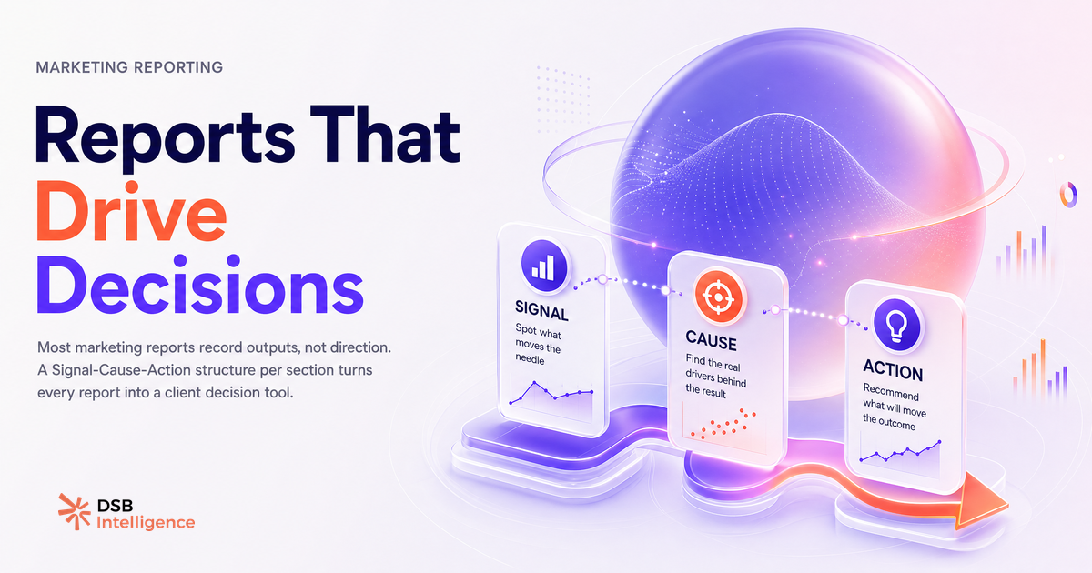
The structure that works in practice follows three layers per section:
Signal. What changed in this period that matters to the business objective? Not "LinkedIn impressions were up 18%." Something like: "Organic reach among VP-level titles in the target segment grew for the third consecutive week, driven by two long-form posts that outperformed the account average by a factor of three."
Cause. Why did it happen? This is where most templates go silent. Naming the cause (a content format shift, a posting cadence change, an audience segment that responded differently) is what separates a reporting agency from a data vendor.
Action. What should the client do, or approve, before the next reporting period? One action per section. Not a list of five "recommendations" that dilute each other.
This three-layer structure works for any channel: LinkedIn organic, paid search, email, content. It scales from a one-page executive summary to a 12-slide board deck. The format changes; the logic doesn't.
For agencies managing multiple B2B accounts, the challenge is applying this structure consistently without rebuilding it from scratch each month. That's where Client Reporting Systems: What B2B Teams Actually Need becomes relevant: the system behind the report matters as much as the report itself.
How does DSB Intelligence Insight Narrator surface the signals worth reporting?
The hardest part of building a decision-ready report is not formatting. It's knowing which signal to lead with.
On LinkedIn specifically, the gap between what's measurable and what's meaningful is wide. Impressions, reactions, and follower counts are easy to pull. Audience quality shifts, content resonance by ICP segment, and engagement patterns that predict pipeline movement are harder to surface without the right layer of interpretation.
This is the job the DSB Intelligence Insight Narrator is built for: it reads the underlying pattern in your LinkedIn analytics data and names the signal that deserves to be in the report. Instead of exporting a table of metrics and deciding what matters, you get a narrative anchored to what actually moved and why it's relevant to the client's objective. The interpretation is built in, not bolted on after.
That changes what goes into the report. The signal is already identified. The cause is already framed. The agency's job becomes validating the read and writing the recommendation, not mining raw numbers for a story.
What does a concrete B2B SaaS marketing plan report look like, section by section?
Take a mid-stage B2B SaaS company, 12 months post-launch, targeting operations leaders at companies with 200-1,000 employees. The marketing plan is built around LinkedIn organic content and a monthly newsletter. Here's what a decision-ready report looks like for a single reporting period.
Section 1: Audience signal. Follower growth is not the lead metric. The lead metric is whether the content is reaching operations leaders in the target company size band. If that number grew, the section opens with that. If it didn't, the section opens with that too, and names the likely cause (content topics drifting toward a broader audience, for example).
Section 2: Content performance. Not a table of posts ranked by impressions. A read on which content format and topic cluster drove the most engagement from the ICP. One example: a three-post series on workflow automation outperformed the account average and generated 14 connection requests from titles matching the ICP. That's a signal worth reporting. The recommendation: extend the series for two more weeks before rotating topics.
Section 3: Pipeline linkage. This is the section most templates skip entirely. Even a lightweight version (how many inbound leads mentioned LinkedIn as a discovery channel in the CRM intake form) connects the marketing activity to the business outcome. Without it, the report is a marketing report, not a marketing plan report.
Section 4: Plan adjustment. What changes in the next period based on what the data showed? Not "we'll continue posting three times a week." A specific adjustment: shift one weekly post slot from thought leadership to product use-case content, based on the engagement pattern from the ICP segment.
For a deeper look at how this kind of structure translates to client-facing deliverables, Marketing Agency Client Reporting: What Clients Want covers the expectation gap between what agencies produce and what clients actually use. And if you're rethinking the format itself, Client Reporting Asset Management: Beyond the Static PDF is worth reading alongside this.
When does a standard report template stop being useful?
A template is a hypothesis about what the client needs to see. That hypothesis has an expiration date.
A template built for a launch phase (where the question is "are we reaching anyone?") becomes misleading at a scaling phase (where the question is "are we reaching the right people at the right volume?"). The metrics that made sense in month two (follower growth, total impressions) are the wrong lead metrics in month fourteen.
The signal that a template has expired: the client starts asking questions the report doesn't answer. Not because the data isn't there, but because the report isn't framed around the current strategic question. That's the moment to rebuild the structure, not add another slide.
This is also where SEO Agency Reporting Software: What Most Tools Get Wrong is instructive: the tool or template that worked at one stage of the client relationship often becomes the friction point at the next. And Client Dashboard: Why Agency-Built Beats Vendor Portals makes the case for why custom structure consistently outperforms off-the-shelf formats for retaining B2B clients.
The test is simple: can your client read the report and know what to approve before the next call? If not, the template is working against you.
Now what?
- Pull your last client report and check the first slide: does it open with a strategic signal or a channel metric? If it's the latter, rewrite the opening before the next send.
- Add a "cause" layer to each section. For every metric you report, name one reason it moved. If you can't name it, that's the gap to close first.
- Add a single recommended action per section. Not a list, not "next steps." One action the client can approve or push back on.
- Audit your template against the client's current stage. If they've moved from launch to scale, the template needs to move with them.
Ready to surface the signals that belong in your next report? Try DSB Intelligence free and see what Insight Narrator finds in your LinkedIn data this week.