

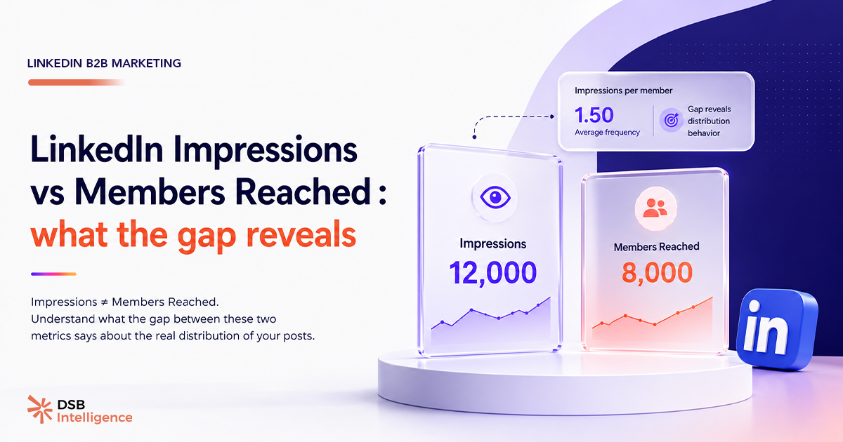
La plupart des créateurs LinkedIn regardent leurs impressions et passent à autre chose. C'est une erreur de lecture. Le chiffre qui compte vraiment est l'écart entre impressions et Members Reached — et ce que cet écart dit de la façon dont LinkedIn distribue ton contenu.
Pourquoi impressions et Members Reached mesurent-ils deux choses différentes ?
Les impressions enregistrent chaque affichage d'un post dans un feed, une notification ou une recherche. Un même membre qui scrolle deux fois devant ton post génère deux impressions.
Les Members Reached comptent les profils uniques exposés, une seule fois par membre, quelle que soit la fréquence d'exposition. C'est la métrique de couverture brute.
Ces deux chiffres répondent à des questions différentes. Les impressions répondent à « combien de fois mon post a-t-il été affiché ? ». Les Members Reached répondent à « combien de personnes distinctes l'ont vu au moins une fois ? ».
Confondre les deux revient à confondre audience et répétition — deux leviers qui n'ont pas le même effet sur la mémorisation ni sur la conversion.
Pour aller plus loin sur la définition exacte de chaque métrique, consulte What Are Post Impressions on LinkedIn : lire le bon chiffre. Et si tu te demandes comment ces chiffres s'articulent avec la portée payante, LinkedIn Advertising B2B : pourquoi tes campagnes sous-performent traite ce sujet en détail.
Que révèle le ratio impressions / Members Reached ?
Divise tes impressions par tes Members Reached : tu obtiens la fréquence d'exposition moyenne par profil.
Un ratio de 1,0 signifie que chaque membre exposé n'a vu le post qu'une seule fois. La distribution est large et non répétée. C'est le profil d'un post qui a voyagé vite dans le graphe social, probablement grâce à des partages ou à une diffusion hors réseau.
Un ratio de 1,5 ou plus signifie que LinkedIn re-sert le post à des membres déjà exposés. Cela peut indiquer deux choses : soit l'algorithme teste une amplification sur un segment restreint avant de décider d'élargir, soit la diffusion est bloquée à un cercle proche et tourne en rond.
Ce ratio n'a pas de valeur normative officielle publiée par LinkedIn. Notre conviction est que le seuil de 1,5 est une heuristique utile pour détecter une concentration de distribution — pas une règle sectorielle. Son évolution dans le temps sur tes propres posts est ce qui compte : si le ratio monte post après post, ta distribution se concentre. Si il baisse, elle s'élargit.
Pourquoi le format influence-t-il structurellement ce ratio ?
Tous les formats ne génèrent pas le même profil d'exposition.
Les carrousels PDF et les vidéos natives retiennent l'attention plus longtemps. Il est probable que LinkedIn les re-serve plus facilement dans les sessions de scroll prolongées, ce qui augmente mécaniquement le nombre d'impressions par membre exposé. Le ratio monte.
Les posts texte courts, eux, sont consommés en quelques secondes. Leur cycle de vie dans le feed est plus court. Ils génèrent structurellement moins d'impressions répétées par profil — le ratio reste proche de 1.
Ce n'est pas une règle gravée dans le marbre : c'est une inférence basée sur le comportement du feed. LinkedIn ne publie pas la mécanique exacte de son système de distribution. Mais cette lecture est cohérente avec la façon dont le dwell time influence la visibilité d'un post — un sujet traité dans LinkedIn Algorithm 2025 : ce qu'il récompense vraiment.
Comment lire cet écart dans tes analytics au quotidien ?
L'erreur classique est de regarder les impressions en valeur absolue et de s'arrêter là. Un post à 10 000 impressions avec 9 500 Members Reached a un profil très différent d'un post à 10 000 impressions avec 6 500 Members Reached — même si le chiffre de surface est identique.
Le premier a touché beaucoup de profils distincts, une seule fois chacun. Le second a tourné en boucle sur un segment restreint.
Pour un post de notoriété ou de prospection, le premier profil est souhaitable. Pour un post de nurturing sur une audience déjà engagée, le second peut être acceptable — voire voulu.
C'est là que l'interprétation contextuelle devient indispensable. L'Insight Narrator de DSB Intelligence décode ce type de pattern automatiquement : il croise le ratio impressions/membres avec le format, la cadence et l'historique de tes posts pour te dire si tu es dans un cycle d'amplification ou dans un cycle de saturation d'audience.
Pour comprendre pourquoi ces métriques varient autant selon le moment de publication, consulte aussi What Are LinkedIn Impressions : portée, fréquence — la fenêtre de diffusion initiale conditionne directement le ratio final.
Quelles limites garder en tête sur ces métriques ?
Les linkedin reach metrics natives ont des angles morts documentés.
D'abord, LinkedIn ne distingue pas les impressions « vues » des impressions « affichées hors champ de vision ». Un post affiché en bas de page sans scroll compte comme une impression. Les Members Reached héritent de cette limite.
Ensuite, les données sont agrégées sur 365 jours glissants dans l'interface native. Tu ne peux pas segmenter par période courte sans outil tiers. Cela rend difficile la détection des variations rapides du ratio.
Enfin, les Members Reached excluent les vues anonymes (membres non connectés, profils en mode privé). La couverture réelle est probablement supérieure au chiffre affiché.
Ces limites ne rendent pas la métrique inutile — elles rappellent qu'elle doit être lue en contexte, pas en absolu. Et si tu te demandes pourquoi ton feed ne distribue pas tes posts de la même façon selon les jours, LinkedIn.com/feed : ce n'est pas un RSS, arrête de le traiter comme tel explique la logique sous-jacente.
Et maintenant ?
- Calcule le ratio impressions / Members Reached sur tes 10 derniers posts. Note les valeurs et cherche une tendance : monte-t-il, baisse-t-il, stagne-t-il ?
- Croise avec le format : est-ce que tes posts à ratio élevé sont systématiquement des carrousels ou des vidéos ? Si oui, c'est un signal de distribution concentrée, pas d'amplification large.
- Fixe un seuil d'alerte personnel : notre conviction est qu'un ratio de 1,5 sur trois posts consécutifs mérite une révision de ta stratégie de diffusion — audience trop restreinte, cadence trop élevée, ou format inadapté à ton objectif du moment.
- Teste DSB Intelligence pour automatiser cette lecture : Essaie DSB Intelligence gratuitement et laisse l'Insight Narrator détecter les cycles de saturation à ta place.