

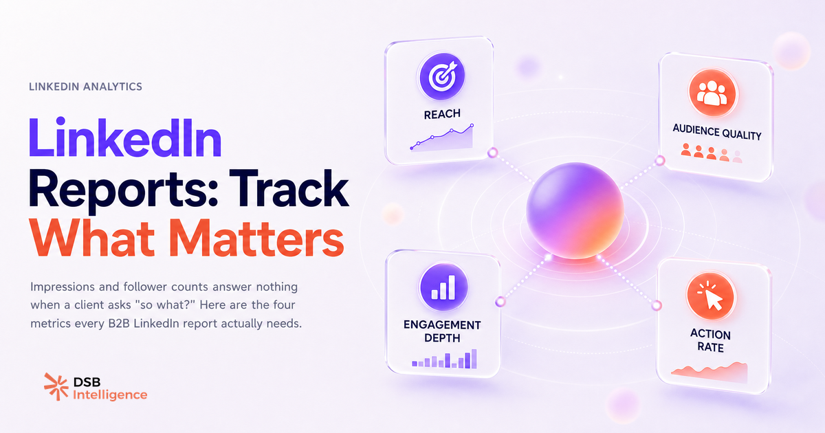
Most agencies inherited their LinkedIn report template from a slide deck someone built in 2019. It shows impressions, follower growth, and an engagement rate percentage. It looks professional. It answers nothing.
Why does the standard LinkedIn report template fail the moment a client asks "so what?"
The standard template fails because it was designed around data availability, not business accountability.
LinkedIn's native analytics surface impressions and follower counts prominently. Those numbers are easy to export, easy to drop into a slide, and easy to color green when they go up. The problem is that a client running a B2B program doesn't care about impressions in the abstract. They care whether the right people saw the content, whether those people moved closer to a conversation, and whether LinkedIn is pulling its weight in the pipeline.
When a client asks "so what?" after seeing 40,000 impressions, the honest answer is: we don't know yet. That's not a reporting failure — it's a metric selection failure. The template was built to show activity, not progress.
This pattern repeats across agencies. A report gets approved in month one because the numbers are new and the client is optimistic. By month four, the client starts asking harder questions. By month six, the engagement rate has become a liability rather than an asset. See Automated Reporting for B2B Agencies: Why Most Setups Break for a detailed breakdown of where this cycle typically snaps.
The fix is not a better design. It's a different set of metrics.
What are the 4 metrics that actually signal progress for a B2B LinkedIn program?
Four metrics belong in the executive section of any B2B LinkedIn report. Everything else is appendix material.
1. Audience composition. Not follower count — follower quality. LinkedIn's analytics let you filter followers by job title, seniority, industry, and company size. If your client sells to VP-level buyers at mid-market SaaS companies, the metric that matters is the share of new followers who match that profile. A page gaining 200 followers per month, 60% of whom are ICP-adjacent, is outperforming a page gaining 500 followers with no ICP signal.
2. Content resonance. Engagement rate aggregates every interaction, including accidental clicks and bot-adjacent behavior. Saves and shares are a cleaner signal. A save means someone found the content worth returning to. A share means they staked their own credibility on it. Track the saves-plus-shares-to-impressions ratio across content types, and you'll see which formats are building genuine authority rather than just generating noise.
3. Profile visit conversion. When content drives someone to visit the company page or an executive's profile, that's a warm signal. Track the volume of profile visits attributable to specific posts, and the visit-to-connection rate for those visitors. This is the closest LinkedIn's organic layer gets to a lead signal without a paid campaign.
4. Pipeline-adjacent clicks. Website clicks from LinkedIn, filtered by UTM source, are the metric most directly connected to revenue conversations. They belong in the report with a trend line, not buried in a traffic source table in GA4.
For a broader view of how these signals fit into a B2B reporting system, Client Reporting Systems: What B2B Teams Actually Need covers the structural logic in detail.
How does DSB Intelligence Insight Narrator turn raw LinkedIn data into a client-ready narrative?
Raw metrics don't tell a story. A client looking at a table of numbers has to do interpretive work that they're paying you to do for them.
This is where the gap between data and narrative becomes a retention risk. An agency that delivers numbers without interpretation is one bad quarter away from losing the account. The client doesn't fire you because the metrics dropped — they fire you because you couldn't explain why, and couldn't tell them what to do next.
Insight Narrator is the DSB Intelligence module built for exactly this translation layer. It reads the pattern across your LinkedIn metrics — audience composition shifts, resonance drops on specific content types, profile visit anomalies — and surfaces a plain-language interpretation. Instead of handing a client a dashboard and asking them to draw conclusions, you hand them a narrative: what changed, why it likely changed, and what the next logical action is.
The output is designed to be dropped directly into a client report or a QBR slide. The interpretation is the deliverable, not the data.
How do you build a LinkedIn report template that survives a quarterly business review?
A QBR is a stress test. The client has had three months to form opinions, and they're going to push on anything that looks like a soft number.
A template that survives a QBR answers three questions in sequence, with no gaps:
- Did we reach the right audience? (Audience composition data, trended over the quarter.)
- Did the content resonate with that audience? (Resonance ratio by content type, with a clear winner and a clear underperformer.)
- Did that resonance translate into pipeline-adjacent behavior? (Profile visits, website clicks, ICP connection requests — with a narrative connecting them to specific content decisions.)
Each section needs three things: a metric, a trend line, and a one-sentence interpretation written in the client's language, not the agency's. "Engagement rate increased 12%" is agency language. "Decision-makers in your target segment engaged with the case study format at twice the rate of thought leadership posts — we're doubling down on that format in Q2" is client language.
The structure also needs an honest underperformance section. Clients trust reports that acknowledge what didn't work. A report that's uniformly green reads as curated, not analytical. Client Dashboard Login: What Agencies Get Wrong covers this trust dynamic in detail.
For the mechanics of building this template without it breaking under automation, Reporting Automation for Agencies: Why It Stalls is the practical companion.
When is a template not enough — what signals does a static layout miss?
A monthly PDF is a snapshot. LinkedIn's algorithm operates on a much shorter cycle.
Content distribution on LinkedIn concentrates heavily in the first 48 to 72 hours after posting. A format that was performing well in month one can start losing traction by week three of month two — and that shift will be invisible in a monthly report until it's already a problem. By the time the template captures it, the client has already noticed the drop in website traffic from LinkedIn.
The signals that static templates miss fall into three categories. First, intra-month content decay: a post type that performs well in the first week but flatlines before month-end. Second, audience drift: the ICP share of new followers quietly declining while total follower count stays flat. Third, competitive displacement: a topic cluster where your client's content was getting strong reach starts underperforming because another voice is dominating the conversation.
None of these signals are catchable in a monthly PDF. They require a live analytics layer that flags anomalies as they emerge, not after the fact. SEO Client Reporting Is Broken — Fix It Now makes the same argument for search reporting — the logic transfers directly to LinkedIn.
The template is the floor, not the ceiling. It gives the QBR its structure. The live layer is what lets you walk into that QBR with a story instead of a defense.
Now what?
- Audit your current LinkedIn report template against the four metrics above. If audience composition, content resonance, profile visit conversion, and pipeline-adjacent clicks are not in the executive section, move them there before your next client delivery.
- Add an underperformance section to every report. One honest paragraph on what didn't work builds more client trust than three slides of green arrows.
- Build the QBR narrative structure (right audience → resonance → pipeline behavior) into your template as a fixed skeleton, not a free-form slide.
- Set up a live monitoring layer alongside the monthly PDF so intra-month signals don't wait until the next report to surface.
If you want to see how Insight Narrator handles the interpretation layer automatically, start a free trial of DSB Intelligence and connect your LinkedIn page in under five minutes.